Tips To Beginning Illustrators
During my first career cycle as an illustrator spanning several years, the majority of commissions I received were from publications–editorial work. My work lends itself to editorial illustration, but this second phase of my illustration career, I’m trying something different, expanding in to new fields, some having to do with advertising. An illustrator at the beginning of their career asked me “what makes an illustration, and advertising illustration?” You can’t give a black and white answer to that question, but there are certainly repeating parameters placed on an advertising campaign, and the illustration must integrate with the advertising concept and successfully sell the product.
Following the Brand’s Color
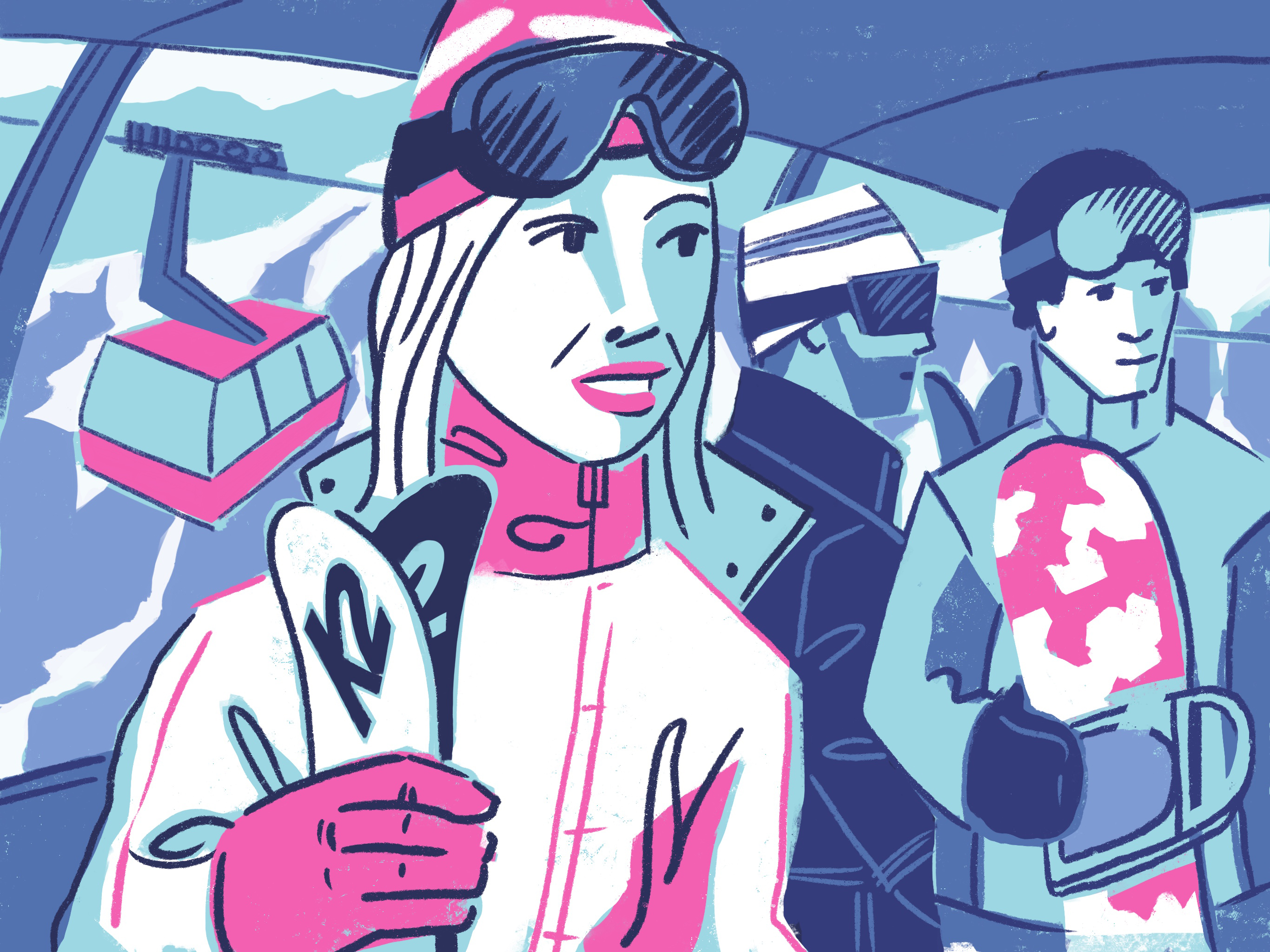
An art director called me from T Mobile for an illustration assignment, and the number one thing I had to follow was the hot pink used in their brand. And, I wasn’t allowed to use a lot of colors with it. Obviously, this is not a requirement for all advertising illustration, but be aware of the brand colors and use them. The illustrations I’ve done for this article, has pink too, but no connection to T Mobile. That assignment was unfortunately canceled by people making decisions out of my control.

Graphic Shapes
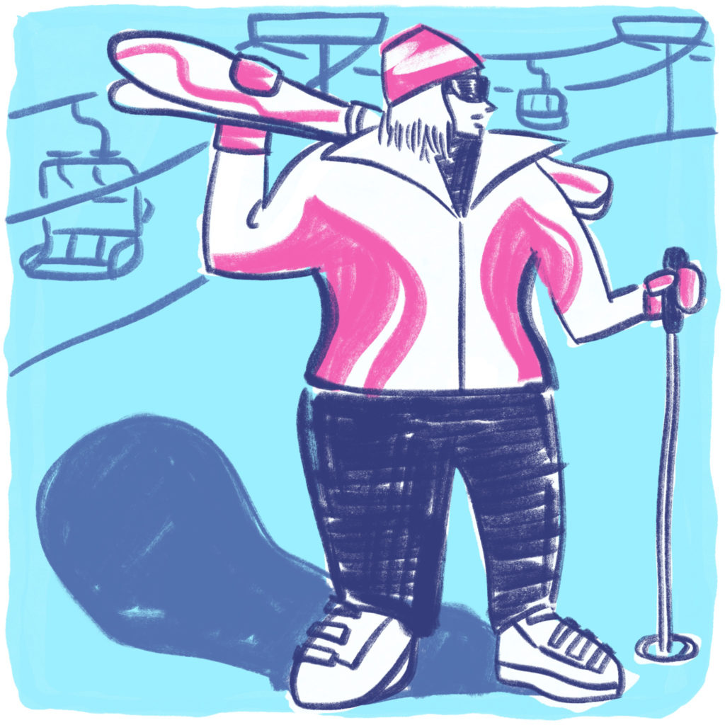
I love texture and smear in fine art and illustration, but rarely will you see misty textured art in an advertisement. Although the illustration above has some texture and smear, the shapes of the trees and skier are still graphic shapes created with bold lines and simple objects. Visually simplistic illustration styles are commonly used in advertising illustration, because the imagery must grab the viewer quickly. In today’s fast past world, people don’t have time to look at a complex image. We hear this to the point where it is a cliché, but is true.
Keep it Happy, Show Success
I also love moody art and music, but the truth of the matter is conveying anything somber only works if it is an advertisement for a problem the customer may have. And, those kinds of advertisements are rare. Otherwise, the majority of advertising illustrations you will see are light in mood, or even comical, and almost always emotionally make others feel good.
Originality, But Not Too Original
You may see a groundbreaking campaign now and again, but those are rare. Most advertising campaigns are derivative of past concepts repackaged. The illustration styles art directors pick are going to be original, but not too original. This is a hard one to explain, but it is this magical combination of the illustration reminding us of something that makes us feel comfortable, but surprises us with aspects of it’s originality. Obviously, it depends on the client as to where on the scale the client falls from conservative comfort to a radical challenge.
It’s in the Data
Data controls what advertisers decide more than ever. Advertising agencies used to run on intuition (think Mad Men) and some data before data became so ubiquitous in the 21st century. Now advertising agencies follow the data primarily, with a little intuition added in. So, here is the hard news for us creative types—illustration will be used as long as the data supports it sells products. There is little we creatives can do about that cold, hard fact. Even, though I call this a “cold, hard fact” I hope I’m wrong, meaning—I hope intuition is still strong in advertising. I say this because intuition is linked to creativity and I like both of those human characteristics much more than data.
The Rise and Fall of Trends in Advertising
One reason I left illustration in 2008, was because it was not being used or valued due to the proliferation of tech, and downturn of the economy. Illustration in 2018 is a hopeful time where I open the New York Times and see illustrations in almost every section, and used on websites as a part of a business’ brand. In 2017, just when I had seen one too many childlike robot cartoon figures on a website, Mailchimp came out with a new branded image with illustrations that redefined what a brand can be. Mailchimp’s new look is one of the most radical expressions of Brand I have seen in years! Just when I started to wonder if the advertising images were a message that we were all turning in to little innocent, robotic avatars, Mailchimp brought humanism back and influenced others to bring back humanism as well. Dropbox followed suit with a new brand with illustration. Google has always been using illustration for their home page (I think you know the link by heart). These trends change frequently, about every 3 years. But, for now, I’m in my happy place. Keeping it human and creating art.